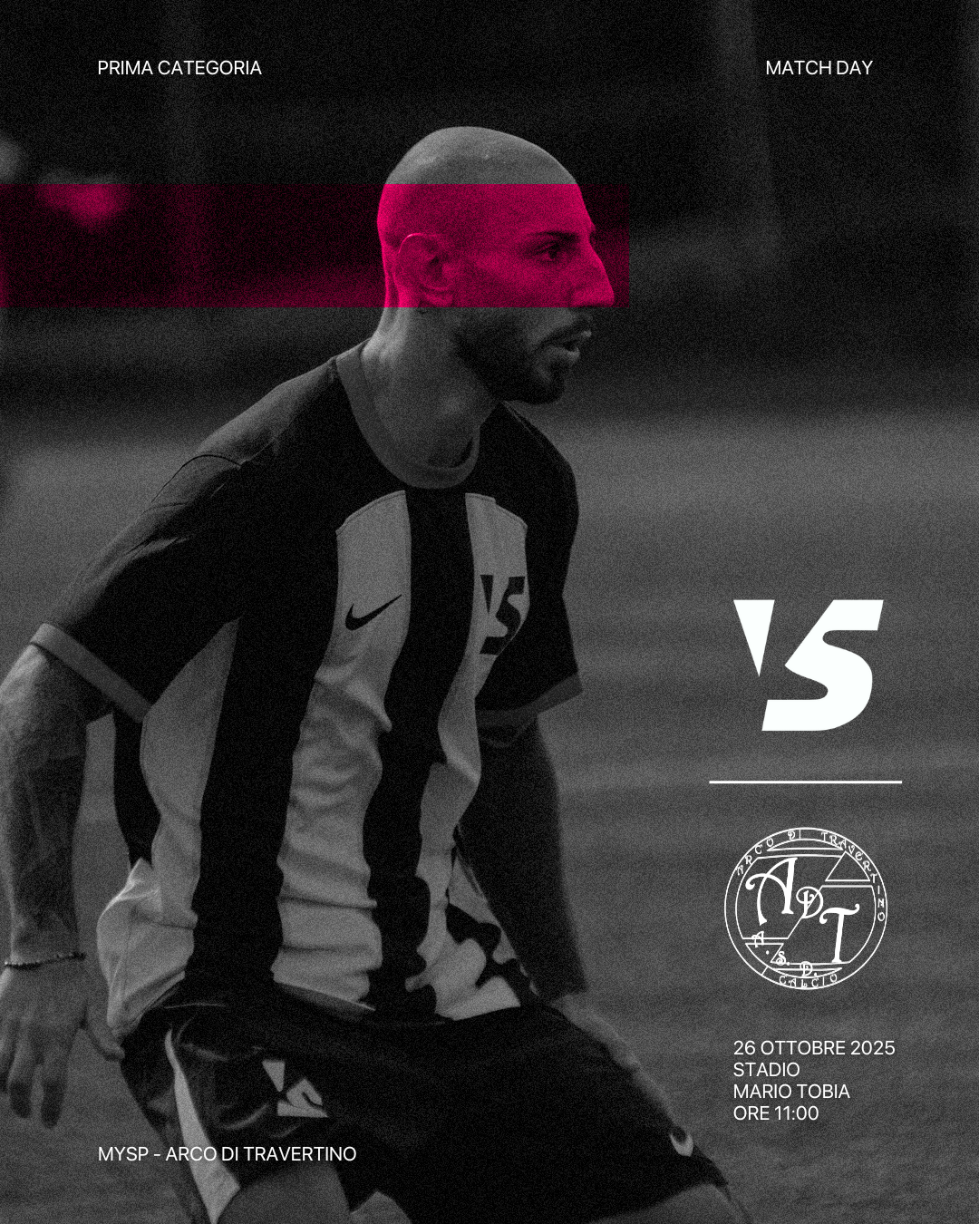
MySP's system centers on SF Pro for one reason: range. With its breadth of cuts and optical sizes, we can build everything-from utility UI to bold campaign headlines-out of a single, coherent family. The accent is sharp-Erasmatas pink: a deliberate breach in the field's neutrals, a nod to the project's female leadership, and a bridge to MySPSport's visual DNA here reinterpreted, not mirrored. The rebrand isn't a flattening or minimal "cleanup"; it's a recalibration toward a clean-yet-rugged voice-precise grids and disciplined spacing paired with raw edges and field textures. That tension lets the pink act as a force multiplier: accessible, assertive, and unapologetically rooted in grassroots football.