Brief & Role — During September 2025, when I was appointed as the Art Director at MYSP, I reimagined the Campus EUR visual identity to make it transition smoothly from being generically club-like to a robust, contemporary system.
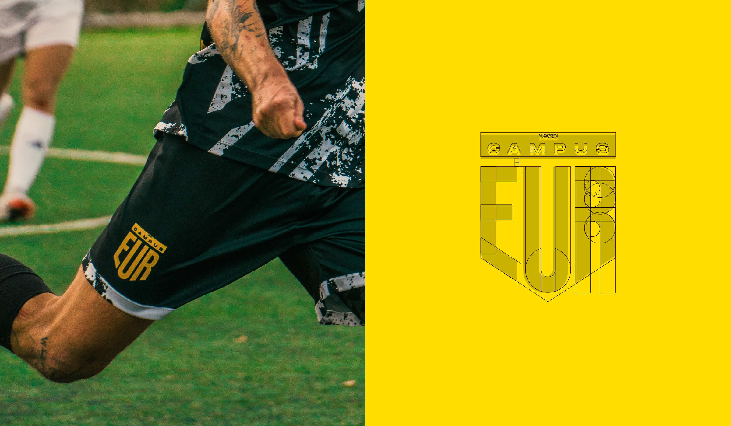
Conceptual Grounding - The design language echoes EUR's urban DNA: a city-within-a-city organized in clear blocks. The identity translates that grid into compositional modules, strict alignments, and strong negative space - order as brand.
Logo Refinement — A light, respectful rework: tightened proportions, better legibility, and clearer small-size behavior. The mark now locks cleanly to the grid, allowing for consistent placement across formats.
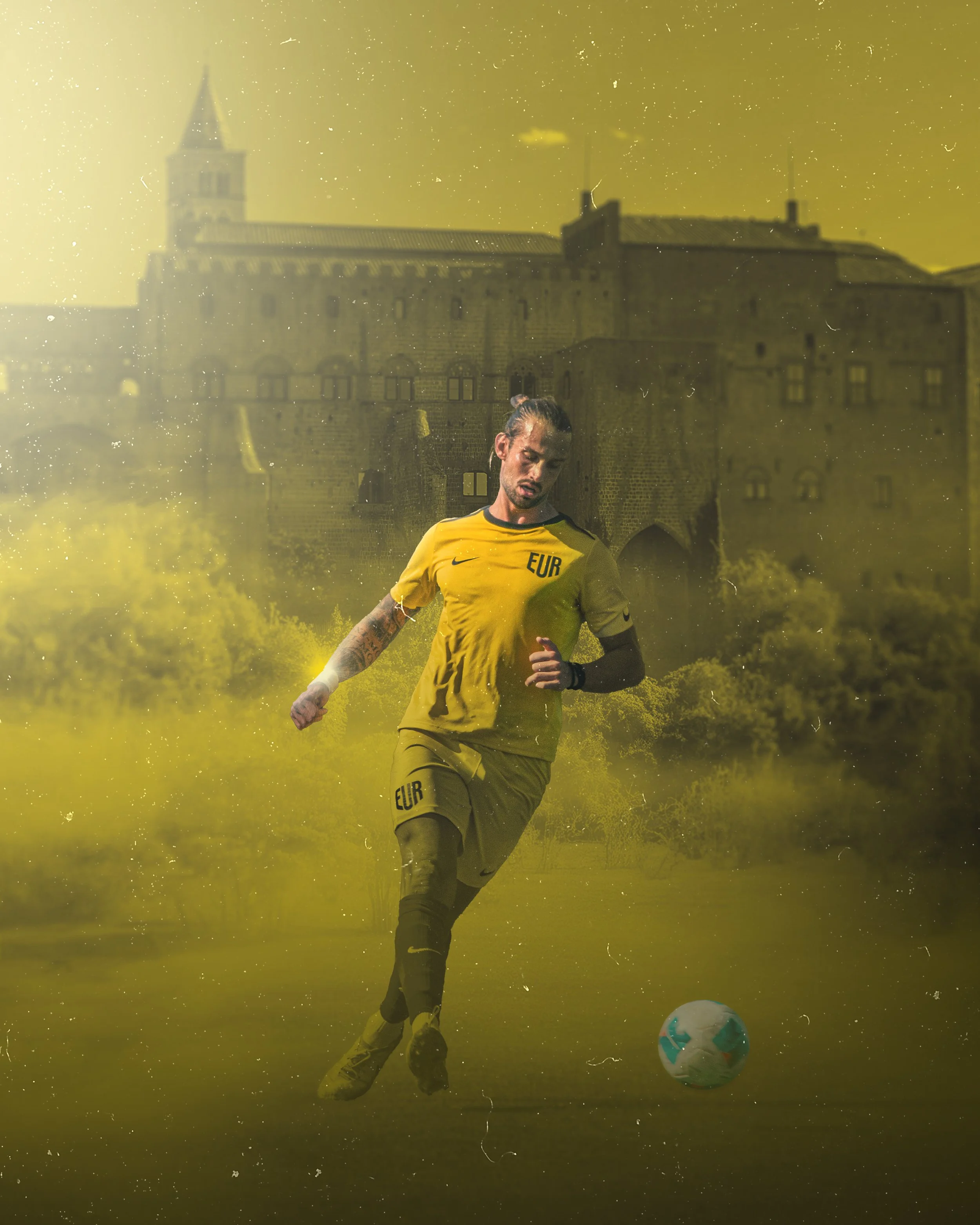
Color System: A disciplined palette with one decisive yellow accent. Yellow serves as signal and spotlight—used as accent against neutrals for the creation of hierarchies, motion cues, and instant recall.
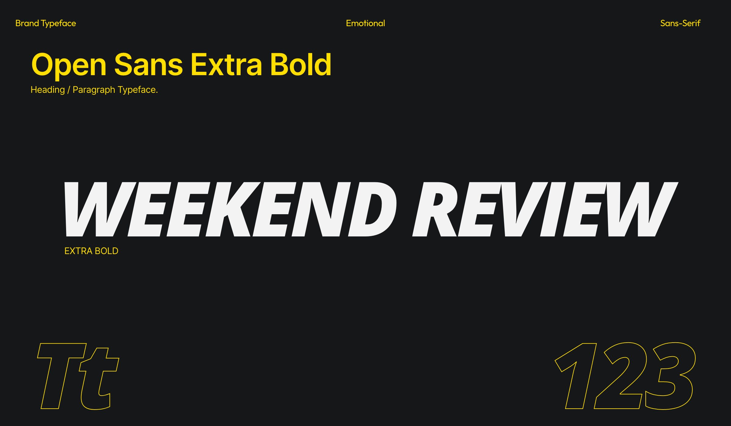
Typography - Inter for clarity of function; Open Sans Extra Bold for impact. It's a readable core with emphatic headers when combined, allowing the making of strong statements without sacrificing accessibility.
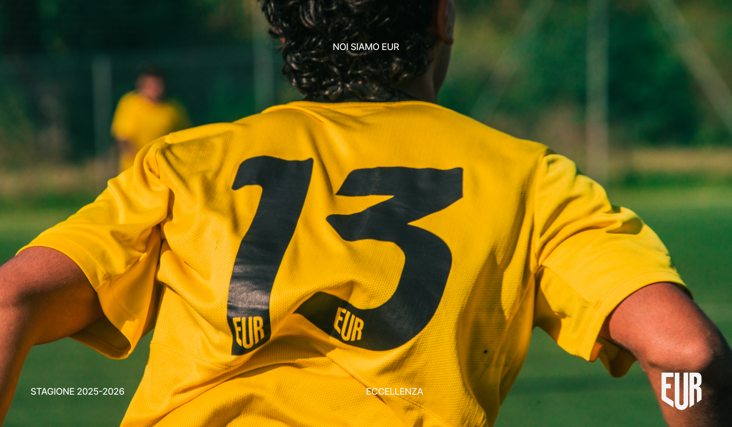
Photography Direction - Block logic extends to image-making, from frontal framing to architectural lines, to layered depth. Players and community sit within EUR's modernist geometry, turning place into identity.
Graphic System: Modular blocks are turned into layouts, data cards, score frames, and motion templates. The system scales from social tiles to large-format banners with a consistent rhythm and pacing.
TONE OF VOICE -Straightforward, urban, and confident. Short lines - clear calls, no fillers: communication that speaks to the same visual discipline and competitive spirit that Campus EUR fosters.