
LR+VISUAL DESIGN+
My Own Brand
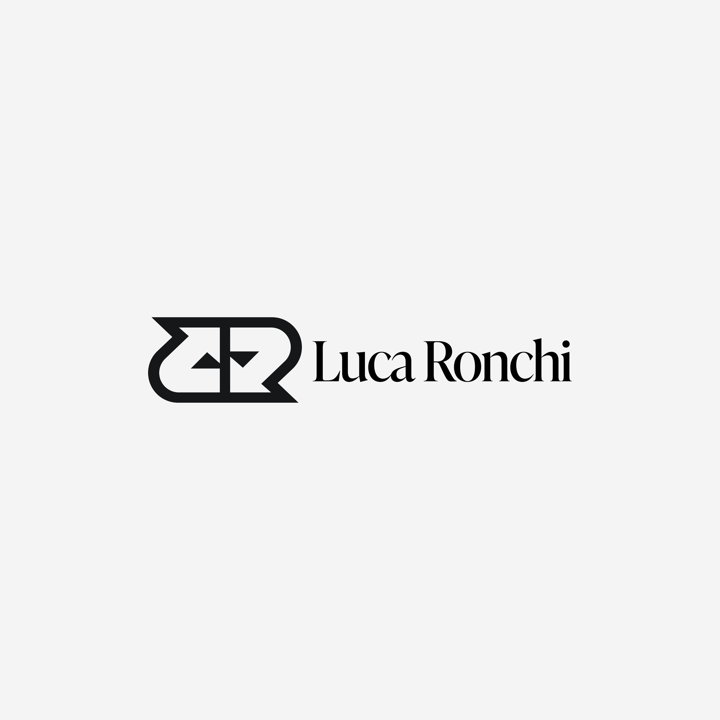
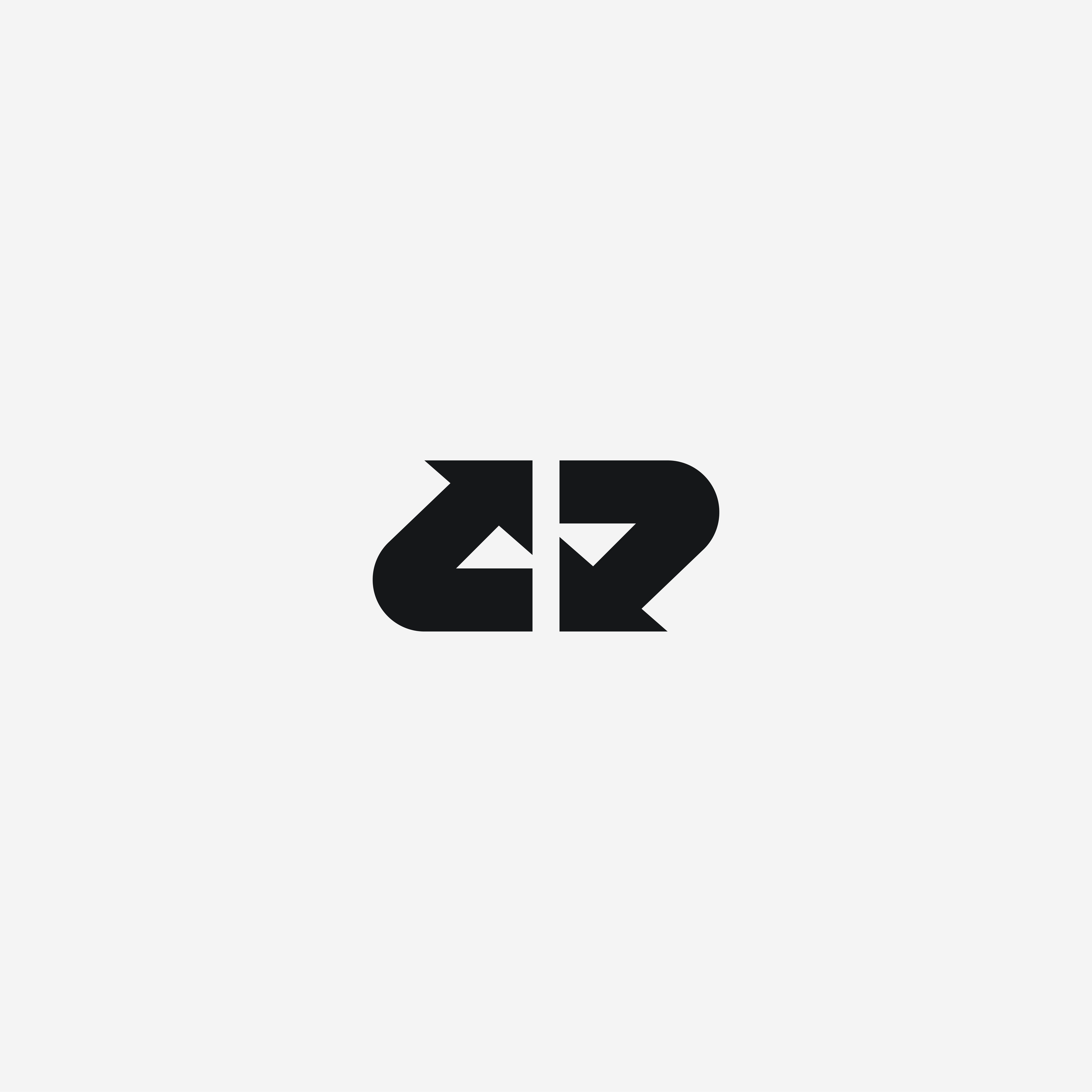
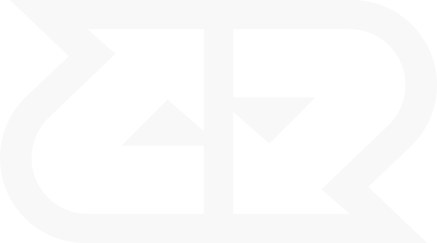
LR / VISUAL IDENTITYVISUAL DESIGNYEAR: 2025
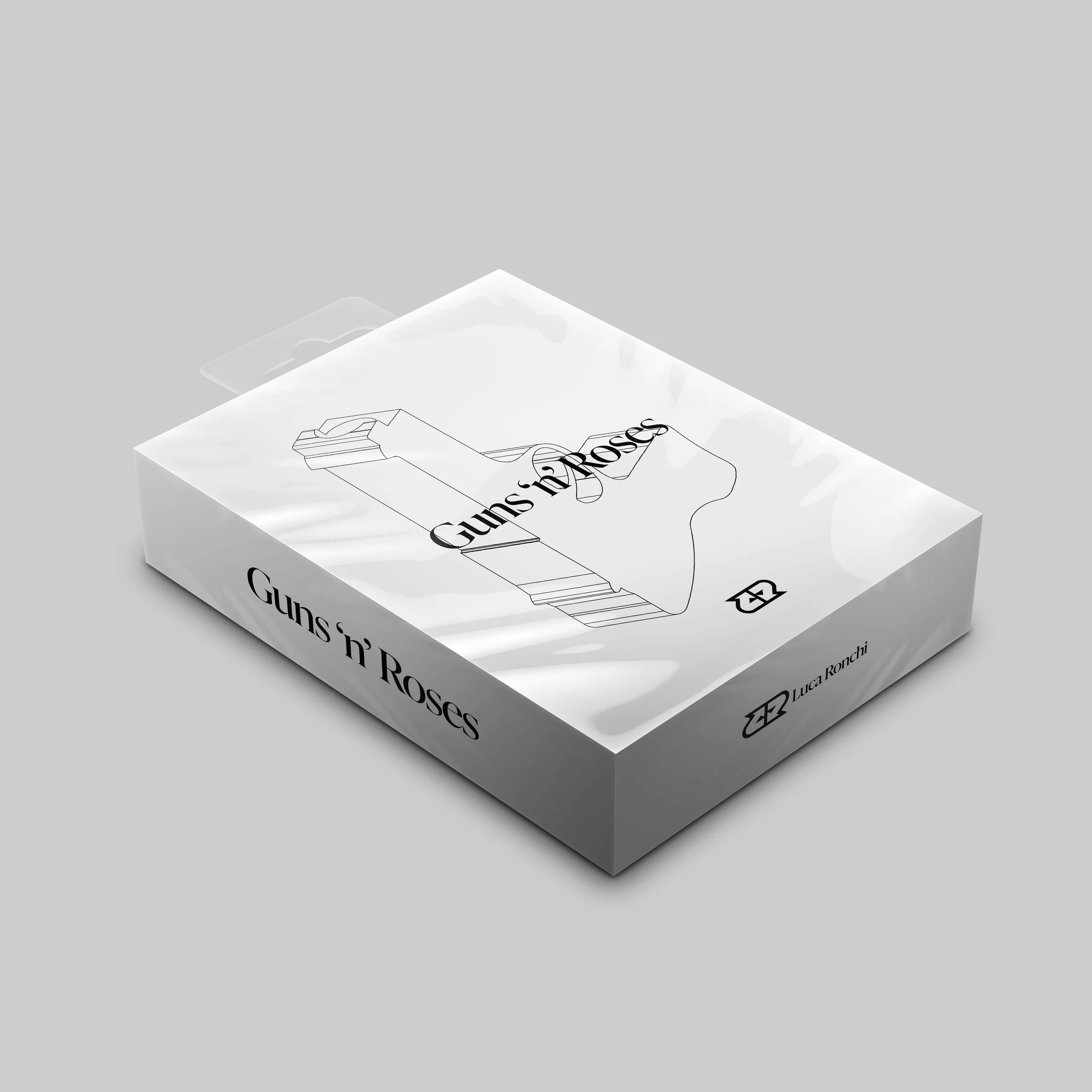
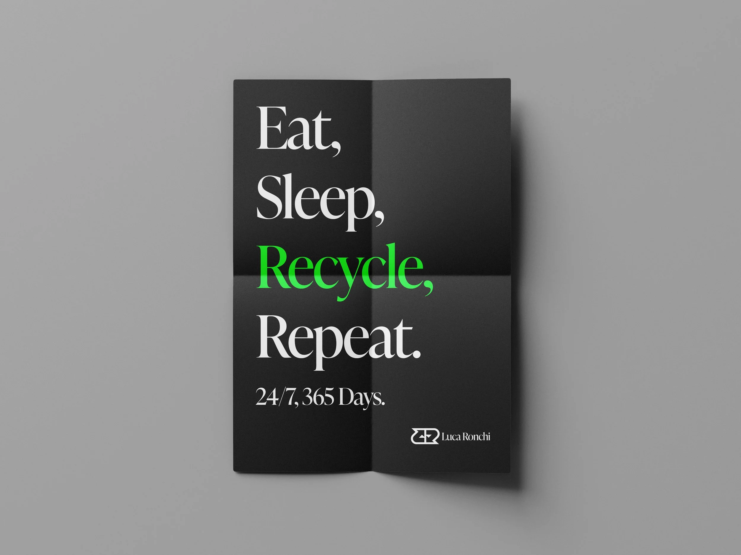
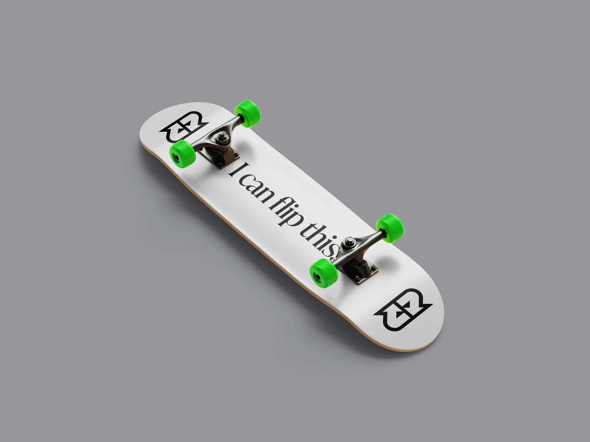
TYPE: DIGITAL & PHYSICALThe LR brand is built around a logo where two arrows form the letters L and R, chasing each other as a symbol of upcycling and remixing. This philosophy runs through all my work: recycling and reimagining in fashion, product design, and art, while remixing in visual design. The identity combines a serif typeface with Pragmatica Extended as a secondary font, and an accent green that recalls Pyrabin, my first project, tying the brand back to its roots in sustainability and reinvention.